No matter whether you are related with some educational institutes in a way or the other, no matter how often you visit some university’s website, probably the first thing that comes to your mind is the navigation. Too often universities websites are well known for bad navigation and complex user interface (UI) design with too much of stuff everywhere and that particular information you want to look for is always very difficult to find. Most of us enter a university site aiming to find some specific information, sadly we end up in searching it with something else information. That’s where a good university website should stand like a superhero.
The Information System (IS) rule should be simple, maximum 2 to 3 clicks and your information is there. Let’s explore what makes a good university website (or a web portal in broader sense) and what a good university website must have from common sense point of view – seriously giving no focus on achieving greater efficiency in serving and enrolling new students by advertising unnecessarily.
1. Search, Search & Search
Well, Search is the most important aspect of any websites, specifically large portals like in university websites where hundreds of thousands of pages are served from their servers every week. A good university website should have a dedicated search panel – when it means search it should cover entire universe of the pages of that university. From people search to course search to library search to students search to journal paper search, or simply whatever category each page of that website is referred to should be connected with that simple yet very powerful search button.

If you are a powered Google searcher, then things might be pretty simple for you. When you are unable to generate the results from university’s or say any website, you can just Google query for that specific website only, with the parameters specific to your search query. Say, you want to find scholarships opportunities in Rice University, the following search query shall guide you even without visiting their website.

2. Dynamic Course Finder
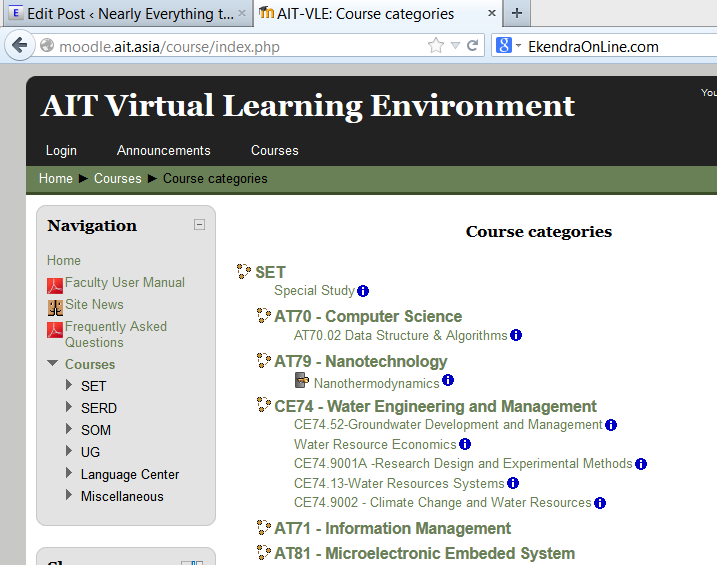
If you are in any university website to find a certain course, wait, before trying that Search button look around for a course finder or maybe a navigation dedicated to courses only. Probably, finding a course is very boring job in sense it is difficult, slow and wasting task unless the university’s webmaster or website designer really put their effort on. What if perspective students see “sorry, 0 results found” – what a shame!
While interactive and filter based dynamic course finder is an excellent option for university’s websites that can be achieved using 3rd party plugins, alternatively this need can be fulfilled via structured menu (navigation) for simplicity. Course finder can be dynamically programmed to show results from the course management system or university’s virtual learning environment (VLE) like Moodle or Blackboard.
3. Personalized University Profile Page
Maybe the title would have been different. However, the need is, a perspective student wants to have his or her own personalized guidance to apply to the university, an already enrolled student wants to have his or her university profile page (let’s say Student Information System : SIS) where all details from courses being attended to payment remaining to presentation remainder for next week can be navigated with a single URL.
A public university student page besides a personalized private profile page could be an added advantage to both the students and the university as this gives an opportunity to share the information of the very student to the public. Most of the universities already have this feature with them. However, a good university web portal or website should not only JUST have custom pages, but should adhere to the standards of design and engineering (W3C Standards), while still fully compliance to the accessibility.
4. Integrated Virtual Learning Environment
Often called as eLearning or online learning, Virtual Learning Environment (VLE like Moodle, Blackboard, VClass) should be integrated part of every university web portal. What malpractice we observe is, VLE is set up different as an standalone application by most universities – even worst when the student login credentials are not the same with your university’s account. A good university website is can not stand away from integrated VLE – the one stop solution for student’s issues, and maybe staffs.

So, basically integration of course or curricula data via Course Management System (like Unit-e, QL, EBS4) into the e-Learning system and both into the main university web portal makes a perfect sense. When we talk about integration of e-Learning system with the university’s Content Management System (CMS), which most probably most universities would be using, we refer to integration of information display and retrieval, while the best practice would still be to deploy and monitor each system (Course Mgmt System & VLE & Student Information System) into a separate database of their own. This provides scalability in the usage of these information systems, yet giving the best output in the main university portal. Learn how ICT4Education can bring in better education via effective Information & Communications Technologies for Sustainable Development
5. Apps & Device Adaptive University Web Portal
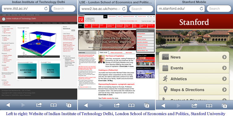
If you are visiting this website from your favorite mobile phone or tablet, then you might are browsing the device adaptive or mobile dedicated version of the website. The usage of the handheld devices is rapidly increasing with mobile contents and dedicated web apps. We still notice many of the large universities still lack device adaptive or mobile version of their websites. Personally, while browsing websites from my smart phone or tablet I leave the website immediately if it is not device adaptive or have no mobile version – there is no use playing around with the mess.

The best practice to make a good university website is to make a dedicated mobile version or device adaptive (responsive) design of the site and/or a mobile app (no matter how simple it is, or it can even be a web app). One time investment into mobile app and mobile website gives an easy access to everybody connected with the university.
So, what’s a Good University Website?
Sadly, no specific example I can suggest you. While there might be many more areas to improve or considered must-have features for any university websites or better say web portal, these top five points are my experiences with university web portal and working with Information System in academia; and of course common practices of being a powerful Internet user.
Frankly, I have not seen something called perfect University Website or web portal; but what is concerned is not perfection (which is hard to define) is how easily user can use the site, in least possible number of clicks, in least possible time frame. What you say! Share your experience.
You might be interested to see this through analysis of Web portal of Asian Institute of Technology (AIT) (work done for personal purposes) – Analysis of AIT’s web services & related technical suggestions


Pingback: Installing WordPress blog or any CMS on Windows Azure cloud, how to
Pingback: SLC Results in Nepal - analysis on Statistics, Trends & Realities
Pingback: Verify & Link various SSO models for ELMS e-academy - a How to guide